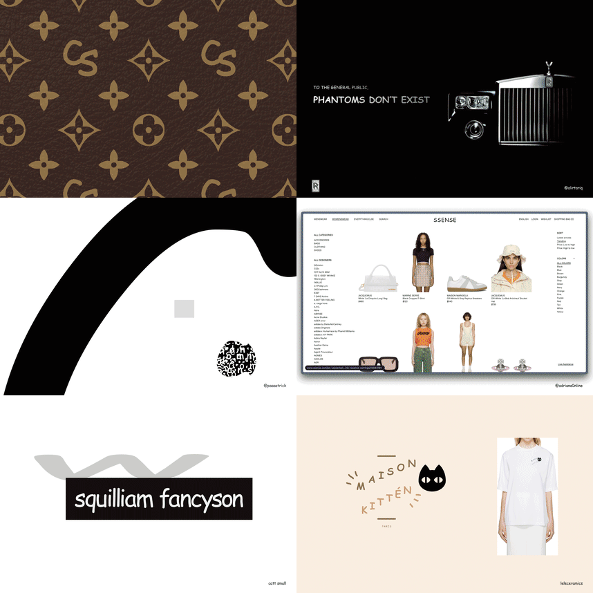
🤩 results from the make comic sans look luxe challenge i ran this week! some discoveries…

🤩 results from the make comic sans look luxe challenge i ran this week! some discoveries…

high fashion brands kinda work bc they’re always trying to push the boundaries already! i was reminded of gucci & lv graffiti-style bags

comic sans looks better (less bad) when it’s in all caps with some letter spacing. this exploration is a good example!

it also seems to work well when you focus on the letters and use them in an oversized way!
