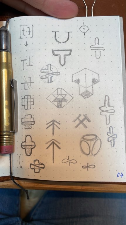
The third ones at the top and bottom are interesting! Is there any meaning behind it?
Thread
Started to draw UIs and Logos on paper, again. The limitations of the page or pens is quite inspiring.

Yes, but I can’t really talk about it in public. But is more like an redesign instead of something new. Maybe I can share the results here when it ready for the world 😅
Will try to create a digital version of some of these ideas. I’m curious about how the client will react 🫣


