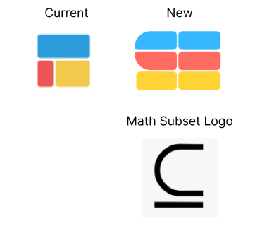
Designer friends: what do you think about this new logo redesign? I like it because it’s still symbolizes the blocks of spreadsheets, is the mathematic subset logo, and kind of draws out an “S” for Subset. Any feedback welcomed!

Designer friends: what do you think about this new logo redesign? I like it because it’s still symbolizes the blocks of spreadsheets, is the mathematic subset logo, and kind of draws out an “S” for Subset. Any feedback welcomed!

I'm thinking that the blocks on the right don't necessarily have to be as wide as the others, maybe make them a bit narrower. And that the tips of the blocks in the middle part they are straight, not rounded.
also re: making it look more like a spreadsheet and making the logo look like a letter, cron does a great job!