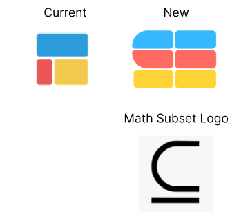
I like where you’re headed it’s more bespoke. What if you leaned more into the “S” form? Are folks likely to recognize the mathematical symbol for subset?
Designer friends: what do you think about this new logo redesign? I like it because it’s still symbolizes the blocks of spreadsheets, is the mathematic subset logo, and kind of draws out an “S” for Subset. Any feedback welcomed!

That’s a good point. No one know this math symbol tbh haha it’s kind of just cool tidbit. What about something like this?

I do like the aim to make it more like an "S". My only thing is how wide it is. Perhaps play around with the width while making sure it still keeps that "S" shape?
I'm thinking that the blocks on the right don't necessarily have to be as wide as the others, maybe make them a bit narrower. And that the tips of the blocks in the middle part they are straight, not rounded.
this is a lot of ideas at once. the original logo is good because it is a visual representation of your core business: spreadsheets. subset is your company name but the subset symbol is not universally known. combining the two and making it minimalist doesn't work.
i suggest focusing on one concept for the minimalist logo you want (spreadsheet OR subset symbol) OR a stylistic change to a maximalist logo that combines both if you still want to represent both ideas. the new burberry and apple's very first logo
Agree on the width. Also reminds me of the Figma logo, but looking great! 👍
- The Current version is too generic, and also too colorful to read as a spreadsheet. Feels more like some layout diagram to me. - The New version with the vertical split reads like two characters: SE…
… - The math symbol is cool. With some customization that could be used as a logo is that symbol is meaningful in your case. But looking at subset.so and understanding your product I see why the current logo is kind of fitting…
…Multiple spreadsheet/sections on an infinite, free canvas. The 3 colors are 3 spreadsheets. For one, I would try to emphasize the free canvas, and also put them in a larger group to subset them.


