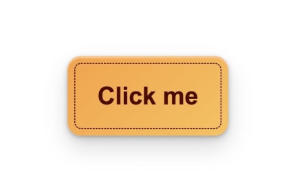
I’ve been playing with shadows in CSS to add depth after reading Refactoring UI. Never realised how many shadows are needed for good looking button.

I’ve been playing with shadows in CSS to add depth after reading Refactoring UI. Never realised how many shadows are needed for good looking button.
