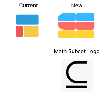
Designer friends: what do you think about this new logo redesign? I like it because it’s still symbolizes the blocks of spreadsheets, is the mathematic subset logo, and kind of draws out an “S” for Subset. Any feedback welcomed!

Designer friends: what do you think about this new logo redesign? I like it because it’s still symbolizes the blocks of spreadsheets, is the mathematic subset logo, and kind of draws out an “S” for Subset. Any feedback welcomed!

this is a lot of ideas at once. the original logo is good because it is a visual representation of your core business: spreadsheets. subset is your company name but the subset symbol is not universally known. combining the two and making it minimalist doesn't work.
i suggest focusing on one concept for the minimalist logo you want (spreadsheet OR subset symbol) OR a stylistic change to a maximalist logo that combines both if you still want to represent both ideas. the new burberry and apple's very first logo