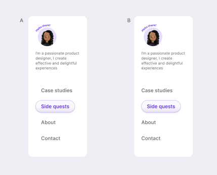
Designers! How are we aligning side panel buttons? A or B?

A! If it's the selected state, you want to make sure that everything is left aligned the same way so that it's easier to read. Although I can see you using B as the mouse over / hover effect.
My concern is the alignment with the other elements. Both feel odd for different reasons. Maybe default states should be aligned perfectly, and the hover effect goes out of bounds left side?