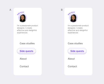
A! If it's the selected state, you want to make sure that everything is left aligned the same way so that it's easier to read. Although I can see you using B as the mouse over / hover effect.
Thread
My concern is the alignment with the other elements. Both feel odd for different reasons. Maybe default states should be aligned perfectly, and the hover effect goes out of bounds left side?
B — since the default state does not have the active menu, it will be clear why this offset occurred when you start interacting with it
but then when you hover the animation reveals the pill, and it becomes clunky cause the texts inside would move left right with every hover...
A, but have you though about making it only round on the right, and straight on the left? That would help
that would still need extra space on the left regardless if it's round or straight...


