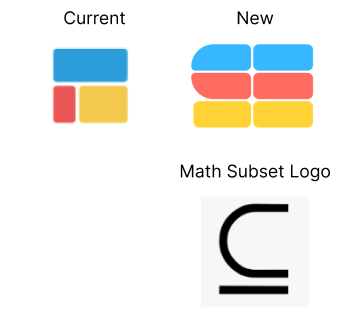
Designer friends: what do you think about this new logo redesign? I like it because it’s still symbolizes the blocks of spreadsheets, is the mathematic subset logo, and kind of draws out an “S” for Subset. Any feedback welcomed!

Designer friends: what do you think about this new logo redesign? I like it because it’s still symbolizes the blocks of spreadsheets, is the mathematic subset logo, and kind of draws out an “S” for Subset. Any feedback welcomed!

I like where you’re headed it’s more bespoke. What if you leaned more into the “S” form? Are folks likely to recognize the mathematical symbol for subset?
That’s a good point. No one know this math symbol tbh haha it’s kind of just cool tidbit. What about something like this?
