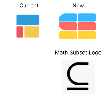
Designer friends: what do you think about this new logo redesign? I like it because it’s still symbolizes the blocks of spreadsheets, is the mathematic subset logo, and kind of draws out an “S” for Subset. Any feedback welcomed!

Designer friends: what do you think about this new logo redesign? I like it because it’s still symbolizes the blocks of spreadsheets, is the mathematic subset logo, and kind of draws out an “S” for Subset. Any feedback welcomed!

I like where you’re headed it’s more bespoke. What if you leaned more into the “S” form? Are folks likely to recognize the mathematical symbol for subset?
That’s a good point. No one know this math symbol tbh haha it’s kind of just cool tidbit. What about something like this?

I do like the aim to make it more like an "S". My only thing is how wide it is. Perhaps play around with the width while making sure it still keeps that "S" shape?
Yeah I like it is more recognizable as an “S”. I agree with @allexander about it feeling a little a wide. Maybe try repeating the radius on bottom right yellow corner to mirror the upper left side?