Posts, a community app by Read.cv

Thread
Michael Andreuzza

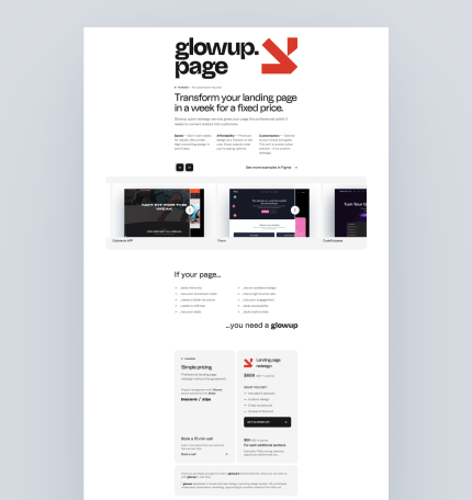
I am looking for some feedback on the copy of glowup.page to see if the message is clear. Any opinion would mean the world. To me, the message is 100% clear that this is for redesigns and refactors. I am pretty sure I could make the message more clear? Thank you in advance!
Michael Andreuzza
Replying to @matteomodica

Ciao! I had some thoughts about that because I really wanted to shows the "work" part on top of the fold, but I guess I could perfectly give some air to that heading...as you mention. You mean to make the logo smaller? Grazie mille Matteo :-)

Matteo Modica
Replying to @michael_andreuzza

Yep, to improve the overall hierarchy and clarity I would: 1) reduce the logo size (to about one-third of its current size); 2) add white space around the heading (and maybe increase its size too). By doing so, your work should be even more visible.

Michael Andreuzza
Replying to @matteomodica

Better now? It looks better live though.

Matteo Modica
Replying to @michael_andreuzza

Yep, I think it's better now. Maybe some additional white space would add even more clarity and balance

Michael Andreuzza
Replying to @matteomodica

Will do! Thank you Matteo!