Posts, a community app by Read.cv

Thread
 @

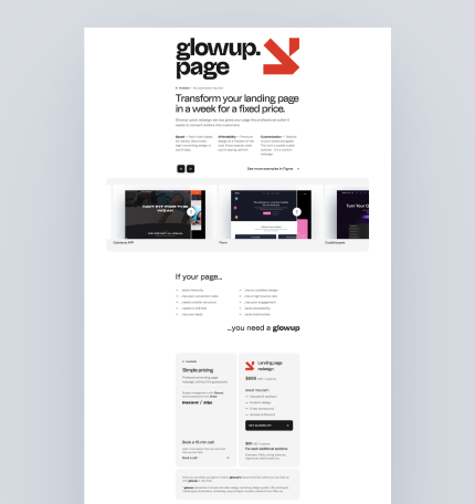
I am looking for some feedback on the copy of glowup.page to see if the message is clear. Any opinion would mean the world. To me, the message is 100% clear that this is for redesigns and refactors. I am pretty sure I could make the message more clear? Thank you in advance!

Matteo Modica

Ciao Michael, my 2 cents. While the overall design looks pretty clean and polished, I would probably: 1) swap the visual hierarchy of the logo and the headline 2) add some whitespace around the headline to make it stand out

Matteo Modica

Yep, to improve the overall hierarchy and clarity I would: 1) reduce the logo size (to about one-third of its current size); 2) add white space around the heading (and maybe increase its size too). By doing so, your work should be even more visible.

 @
Replying to @matteomodica

Better now? It looks better live though.

Matteo Modica

Yep, I think it's better now. Maybe some additional white space would add even more clarity and balance

 @
Replying to @matteomodica

Will do! Thank you Matteo!